User-focused Product Designer
I’m a Product Designer with 9 years of experience and I’m passionate about leading teams in the development of products that are both attractive and easy to use.
I’m a Product Designer with 9 years of experience and I’m passionate about leading teams in the development of products that are both attractive and easy to use.
My philosophy is grounded in Human-Centered Design (HCD), focusing on solving problems by prioritizing the human perspective at every stage of the design process.
I’m dedicated to deeply understanding users through user research, creating effective business solutions with meticulously designed prototypes, and rigorously testing to ensure the design's impact and success.

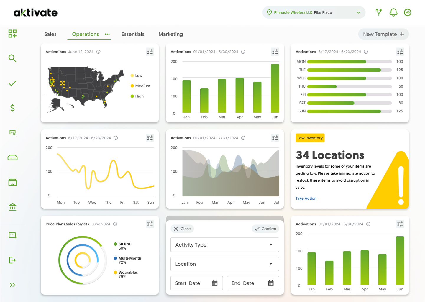
At Cricket Wireless (AT&T), I spearheaded the design of the back office client dashboard. This dashboard provides clients with a comprehensive view of their stores, including operating hours, inventory management, and sales data.
I collaborated with executive stakeholders, product leads, and sales representatives to acquire second-hand research and gain insights into customer needs.
I designed a preliminary dashboard in Figma which was presented as a discussion point during an annual conference with customers from various regions. Customers provided feedback on the design’s usability and usefulness, prompting me to make iterative improvements.
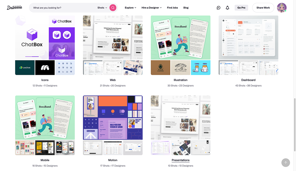
Drawing inspiration from Dribble, Mobbin, and my personal interest in cryptocurrency trading charts, I aimed to effectively visualize data based on familiar and attractive formats. I then collaborated with data analysts and engineers to grasp the capabilities of the data visualization library d3js.
I crafted a visually appealing and user-friendly dashboard that effectively visualized the most critical data for customers. This streamlined access to business information and facilitated informed decision-making without the need to switch between multiple platforms.
Additionally, I incorporated customization options to align the dashboard with each customer’s unique business requirements.

Blueprint Title is a tech-focused real estate closing and title insurance company. The core features of its application is designed to facilitate communication and sensitive data between parties across transactions.
Here, I led the design of new product features for the organization’s real estate transaction management system (RTMS).
I began my approach with a heuristic evaluation. This method allowed me and my team to quickly identify UX flaws without the need for extensive user testing. Many of the inconsistencies and challenges I discovered during the heuristic evaluation were validated by reviewing user data from FullStory sessions.
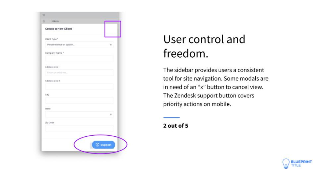
I created the Mango Design System for Blueprint Title. This is a collection of intelligent user interface components, driven by a unique set of principles and guidelines. The implementation of the design system is intended to enhance the usability of the Blueprint app as well as the organization's various workflows.
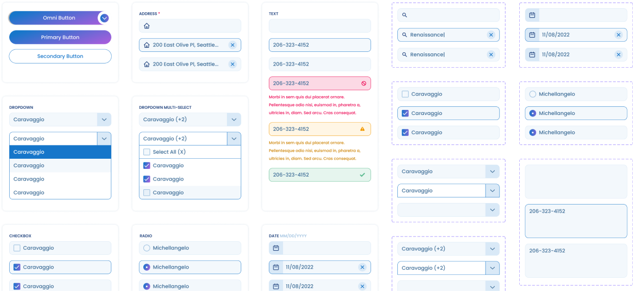
The design system was vital in the creation of features like the Status Tracker; a feature that allows customers to view and manage the progress of a transaction and its related tasks throughout the life cycle of a transaction.

The Arthritis Foundation is the largest nonprofit organization dedicated to the prevention, control and cure of America's leading cause of disability.
At the Arthritis Foundation, I improved the flagship marketing website by restructuring the information architecture and enhancing the user interface, making the user experience more accessible and user-friendly.
While analyzing data from Google Analytics and Alexa to identify patterns in user behavior across the site, I discovered that a substantial number of users were searching for health-related content. Subsequently, I found that users were redirected to broken links and sub-standard content pages.
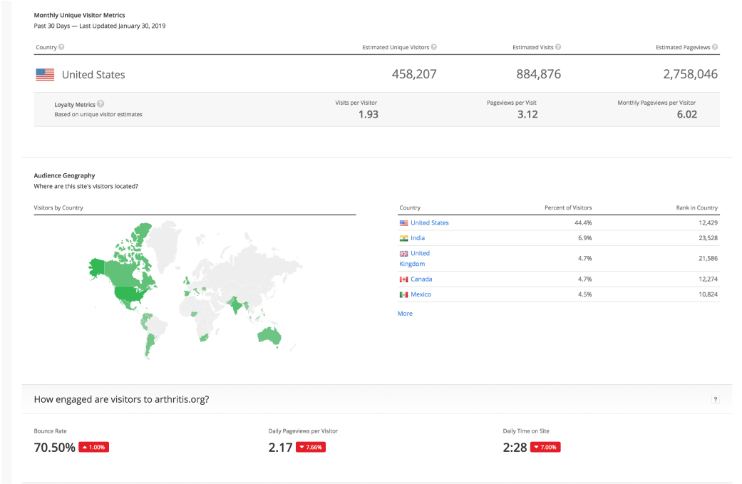
Using Semrush to analyze keyword trends, a discovery of "arthritis-related recipes" were among the most commonly searched keywords. After facilitating several UX activities including card sorting exercises, it helped my team to better index content with relevant tags.
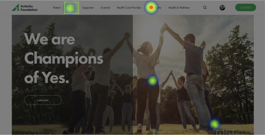
Using a combination of click tests and surveys gave me a better understanding of different user segments and how each group navigated the site.
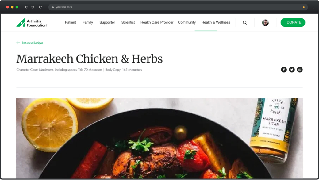
I developed a series of scaleable, reusable components for use in the construction of the new website. This approach helped to create consistency across the design library and streamline the development of the project. Following that, I worked with medical writers and nutritionists to craft the health and wellness hub; a pillar of the website where we repurposed old articles and created new articles based on data-driven demand from our users.
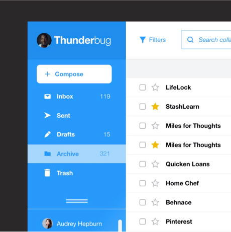
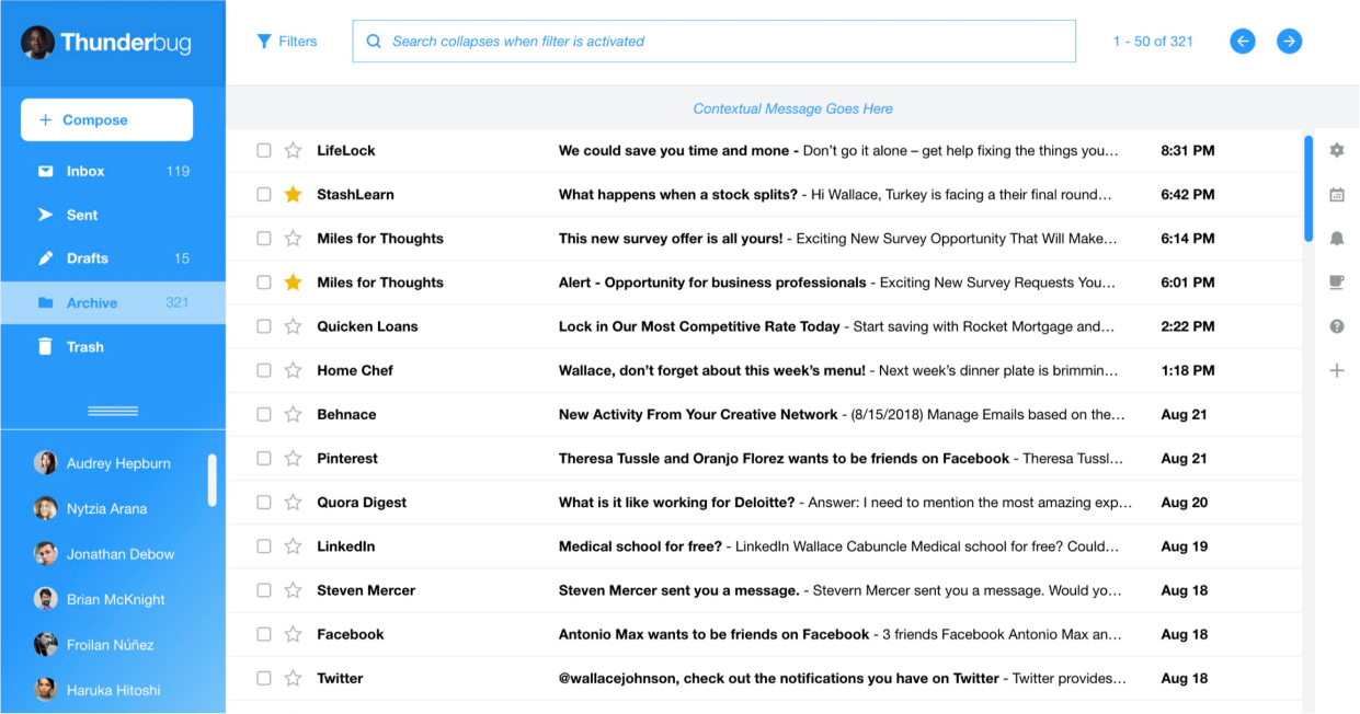
A sleek, functional, and original email client design, designed to practice information architecture and elements of user interface design.

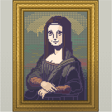
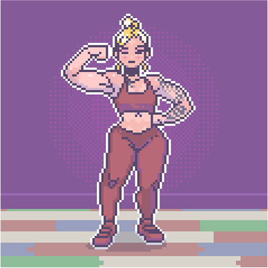
This collection features a variety of illustrations and digital graphics from both professional and personal projects, reflecting my passion for storytelling, problem-solving, and aesthetics.
I believe that each piece demonstrates my ability to translate ideas into visually engaging and meaningful creations.


Lead UX Visual Designer
“Michael is one of the best designers I’ve ever worked with. He is diligent, precise and a dedicated UX practitioner who always goes beyond expectations. While working together, he juggled multiple projects and yet, was always open to engage with team members for collaboration. He is phenomenal and will be an incredible fit for any team. If I had the chance to work with him again, I would do so in a heartbeat.”


Diligent Digital Strategist
“Michael was a joy to work with. His passion for every project he touched, no matter how big or small, was always apparent. Not only did Michael go above and beyond for clients — he also did for Arke and the Experience Design team, serving as a true team player and employee advocate.”

Senior UX Consultant
“A talented, curious, empathetic, and hungry designer like Michael is rare to find. He’s always ready to help and to jump on a fire while remaining calm and focused. And if he doesn’t know how to do something, he’ll learn it and be proficient the next day.”

Senior Front-End Developer
“It was an absolute pleasure getting to collaborate with Michael. He is one of the most talented designers I have ever worked with, but he is also incredibly thoughtful, kind, and punctual.”

Creative Strategist & Designer
“You get a sense that he is on the pulse of what matters while keeping his cool amidst the chaos. Admirably, I’ve witnessed him tackle tasks and expectations in a calm and timely manner, and with the precision, it takes for a project to be truly successful. And if you need a good laugh or any comic relief, Michael will provide the icebreaker through wit and punchline.”

Sr. Director of UX
“I also had the opportunity to partner with him on multiple client deliverables, and was always impressed with his client-facing demeanor. He has excellent communication skills and handles very stressful situations calmly and rationally. I often caught him at the office late into the evening working to hit impossible deadlines, which he always managed to do, regardless of the circumstances.”

Schedule a call via Calendly or send me an email to see how I can help with your latest design needs.
 Schedule A Call
 Email Me
 My Resume